Which design won?
11 / 11
Preferred the Detailed variant (100%)
Headline: Every participant’s stated preference maps to the Detailed layout (named goals on-card + richer visuals) when coded by what they described—not by UserTesting’s A/B label alone.
| Variant | What it is | Result (n=11) |
|---|---|---|
| Winner: Detailed | Named goals on the card (e.g. retirement, wedding, long-term care), richer layout (Option1 / Option3 mocks); 79% shown with a donut chart in Option1 | 11 / 11 preferred (100%) |
| Simple | Aggregate “7 active goals” without listing them on-card; lighter layout (Option2) | 0 / 11 |
How we counted: UserTesting labels Version A / B swap with counterbalancing. Preferences here are coded by what people described (visible goals vs. count-only, visuals, density)—not by letter alone.
One-line takeaway: Users consistently want goal names and amounts on the summary view, plus stronger visualization for probability—not only a headline 79% and a goal count.
The designs we tested
Each mock shows the web card (left) and mobile frame (right). Select an image to open it full size.
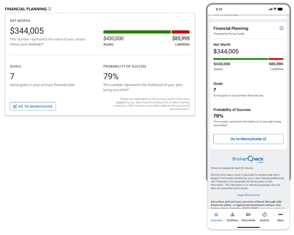
Simple Option2 · 0 / 11 preferred
Goals shown as a count only (“7 active goals”); 79% as plain text with no chart.
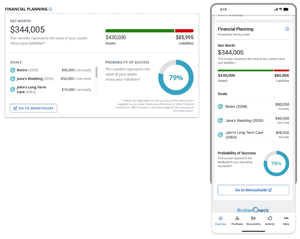
Detailed Option1
Named goals with amounts and a donut chart for 79%. Known mock error: the desktop footnote under 79% repeats the net-worth wording.
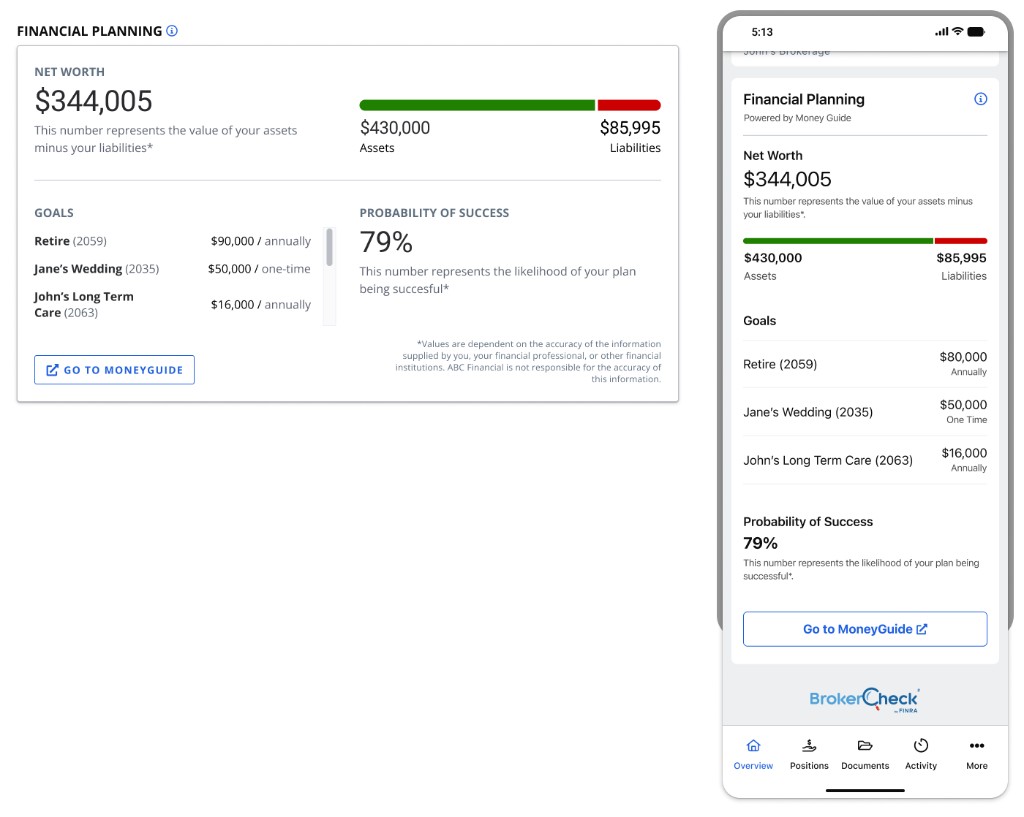
Detailed Option3
Same named goals as Option1; 79% as text with the correct “likelihood of your plan being successful” footnote.
Detailed (Option1 / Option3 combined): 11 / 11 preferred.
What worked — verbatims
Why the Detailed direction resonated
-
“[Version] A provided me with context to the 79% that I thought was really valuable, the … wedding, retirement and all that.” User 01
-
“This I like so much better … when I'm supposed to retire, how much annually … daughter … married in 2035 and long-term care.” User 02
-
“Breaks down the goals … instead of just like seven and then I have to go in and see what they are.” User 03
-
“I like version A … same amount of real estate and has got more information.” User 05
-
“I kind of like the chart … that piece that's still missing.” User 06 (vs. number alone)
-
“Different visualizations of my progress and my goal … visual presentation better.” User 07
-
“Version A was easier to understand … additional details about the breakdown of the goals.” User 08
-
“Right amount of information … grasp exactly what we're looking at.” User 09 (on A)
-
“Go with version A because I like seeing my goals.” User 10
-
“Version A is definitely my preference … more details regarding my goals … better visual.” User 11
Recurring positives (no quote): Net worth and green/red assets vs. liabilities read quickly; mobile generally felt easy and consistent with desktop; high-level dashboard framing is welcome if drill-down exists.
What struggled — verbatims
Friction with Simple, copy, and the 79% metric
Simple / “goals as a count only”
-
“In version B I think the goals are missing.” User 03
-
“Goal seven. What are they? … click through more stuff.” User 05
-
“Can't see any [goals] in version B.” User 10
-
“Not … showing me the goals, just … how many I have … don't see that graph visual for the 79%.” User 11
-
“Version B … very bland … more from that high level view … if I don't have time to drill down.” User 11
Understanding / trust of 79%
-
“I lack some context to what the 79% really represents.” User 01
-
“On the website … assets minus liabilities … on the mobile … likelihood … subtle, yet meaningful.” User 01
-
“I'm about 79% of the way there.” User 03 (treats probability like progress)
-
“Probability of success … but then it says … assets minus liabilities … not the plan … kind of confused.” User 03
-
“Not quite sure how it's contributing to my goals … does this 79% take into account my goals?” User 11
Density / scannability (Simple feels too thin)
-
“Seven … 79% … kind of a little light … more difficult … what exactly they are.” User 09
-
“B … a bit light … click further … what … goals are.” User 09
Brand / IA surprises
-
“Broker check … not what I thought broker check could do.” User 02
-
“Curious why … broker check … where you look up … brokers and investment advisors.” User 05
CTA / next steps
-
“Don't know what money guide is … only thing that I can click on.” User 10
UX designer callouts (actionable)
-
Ship the Detailed pattern for the summary card
List named goals (and key amounts / timing) on the hero view. The 7-only treatment consistently reads as incomplete, bland, or forcing extra clicks without payoff.
-
Make “probability of success” self-explanatory
Multiple people conflated 79% with progress, “percent of the way there,” or average across goals. Pair the number with short scope copy (what horizon, what “success” means) and/or education / tooltip / “How this is calculated.”
-
Align copy across web and mobile for the same metric
Mismatched footnotes under 79% undermined trust (User 01, User 03). Fix
Option1-style desktop errors so probability never reuses net-worth language. -
Keep or strengthen the chart
Users called out pie/donut (or similar) as helping them see the “missing” slice and compare variants (Users 06, 10, 11). If you simplify visuals, test that you don’t lose this clarity.
-
Add a “goal health” line—even on Detailed
Even when goals are listed, people still ask: on track? behind by X? what changed last year? levers to improve (Users 11, 04, others). Consider a compact status per goal or a single plan health line tied to 79%.
-
Progressive disclosure, not data hiding
Users want a clean landing (User 09) and enough goal context to understand the headline without drilling. Click targets for assets, liabilities, and each goal should be obvious; Money Guide needs a clear value prop if it’s the main path.
-
Surface composition without clutter
Requests for asset/liability listings or breakdown at a glance (Users 01, 08, 09)—balance with expand / rows / secondary panel so the card stays scannable.
-
BrokerCheck (mobile)
If the logo stays, set context (why it’s here) or expect confusion vs. FINRA BrokerCheck expectations (Users 02, 05).
-
Emotional comfort vs. honest probability
Some want 90s or 100% to “feel confident” (User 10). Design copy and coaching that doesn’t overpromise while still explaining what improves the score.
-
Optional depth (power users)
Per-goal probability, investment performance over time, liquidity/penalties, retirement calculator—requested after summary (Users 04, 07, 09, 11). Good candidates for second screen or linked flows.
Methods note
- Platform: UserTesting web, balanced comparison (which design appeared first varied).
- Stimuli: Web card + mobile frame per variant; see The designs we tested (source PNGs in project assets/).
- This page: Preference by design substance; full session notes in research-log.md (parent folder).